
Some great ideas are born in garages. The squirrel census launched over a ping pong table.
Jamie Allen and Nat Slaughter were trading lobs at a sandwich shop with some friends in the Inman Park neighborhood of Atlanta. Allen tossed out an idea for a short story he was writing, mentioning that for research he needed to work out how many squirrels lived in Inman Park. Slaughter countered that he had an interest in data visualization and maps and could help out.
“My intuition told me I should do it,” he tells Resiliency Maps in a phone interview. And that’s how a few remarks parried over a six-inch net led Slaughter to devise what may be the most detailed map of New York’s Central Park. Since the 2012 and 2016 Inman Park Squirrel Census, the original group of census takers — about two dozen people, including kids and dogs — dispersed from Atlanta but the mission has kept them together, finding a home in New York. The most recent count took place October 6-20.
As the official cartographer, Slaughter was tasked with orienting the volunteers counting bushy-tailed mammals scampering around the 349-hectare park.
His toolkit? “QGIS but mostly Adobe Illustrator and pen and paper,” he says. Bridging them is the MAPublisher plugin that brings in all the “fun capabilities of QGIS or ARC GIS with the beautiful interface of an Adobe product.”
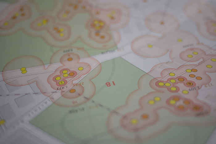
Slaughter, a designer at Mapbox, soon realized that the mapmaking required was indeed a tough nut to crack. Well, for starters, he needed two kinds of maps: one for volunteers and another to visualize census results.
The Tally Map for squirrel sighters, as volunteers are called, has to carry enough information to guide them to 100-meter squares, roughly the range of a squirrel. And once they spot an Eastern gray squirrel (Sciurus carolinensis)? Volunteers must plot the location where the animal first came into view as accurately as possible.

North of Bedrock
The shoutout for volunteers requested map-reading skills, but some training was still in order. Each square is surveyed twice, with counts in the morning and afternoon, each session starting with a brief orientation.
First point of interest: How big is a hectare, anyway? Team members planted two flags 100 meters apart to show the distance. When Slaughter briefed volunteers, he shared tips for navigating the space — find a corner of the hectare and visualize down a line 100 meters or note the edges of the hectare based on landmarks. Or to stick close to edges and move inward or start at highest point in elevation and work down. Showing people where North was also turned out to be very important.
It’s a big park, and sometimes people were very confused about how to get to their plot. Before sending them off, he’d ask if they had concerns about where they’re going and see who looked nervous.

On many park maps, it’s natural to orient people with hardscaping features like benches and sewer covers, but Slaughter found them unreliable markers. Some that were present on other maps had been moved or removed and others were spotty. So he relied on other features, like Central Park’s signature bedrock. “There’s a lot of exposed bedrock – that was a critical part of the map to help people define hectare boundaries.”
He kept the symbology simple (dashes for dirt paths, for example) but noted details like the number of stairs in each staircase and some three kilometers of footpaths that don’t appear on any publicly available map. Those are a few reasons why the version he takes into the field around measures 18 inches by 6 feet. As for points of interest, buildings were shown with footprints but he “tried to draw as much as features themselves and not represent them with abstract symbols.”
Sketchy weekends
He didn’t start out with the idea of making a new map. He researched both historic maps and contemporary versions like OpenStreetMap and the NYC Open Data Portal “great sources, but for the scale that we needed to work at and the level of detail, other than the two-foot interval contour line, 90-95 percent of everything needed to be redrawn,” he says. “It was a bit overwhelming to realize that but also just a fun opportunity.”
He recognizes that the map will probably never be complete. “That’s the reality of maps, unfortunately. You can never have a perfect map but that’s OK.”
What’s next? Slaughter expects to spend another another month or so working on the maps before diving into data entry. Volunteers handed back about 700 small hectare maps marked with pencil plot dots that he’ll enter into a table then use QGIS to get longitude and latitude coordinates before concatenating with the other data fields that volunteers collected. “That’s a bit of work, then there’s analysis once you get it into a form that you can play with and pull out narratives.”
Once the results are in, he’ll get to work on visuals for the report slated for spring 2019 which usually also features a large fold-out map. He demurs picking a favorite from previous efforts, saying he tries not to revisit them (“I see all the ways they could be better.”)

Slaughter reckons he’s spent 325 hours, give or take, mapping over the weekends commuting from his Washington, DC. home base. He just laughs at the notion that it’s just slightly obsessive.
“I’m having a blast, there’s nothing else I’d rather be doing,” he says. “What’s more important than working on making a beautiful map?”
Cover photo // CC BY NC