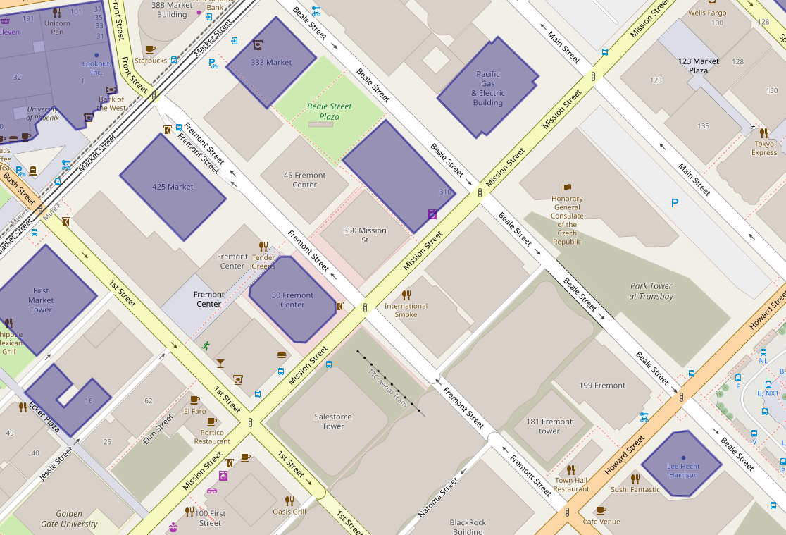
Update: The NYT may have undercounted the buildings, there are 48 not 39. More on that here.
I’ve been looking for ways to use OpenStreetMap to make personalized maps and spotted some earthquake maps that the Japanese OSM community made with uMap, so it looked worth testing for this project.
The New York Times recently ran a story about San Francisco buildings – mostly downtown and South of Market – with steel frames that harbor particular risk in the next major quake. The story offered a small, static map and because many of them are in the SOMA neighborhood — the area of our pilot — it seemed a good idea to make a more interactive map.
So here’s a simple map of the 39 addresses from the story. Full disclosure: this is the handiwork of a casual mapper trying out a new tool. It was fairly heavy going for a quickie map – the polygon tool was clunky/imprecise and importing the list as a cleaned up .CSV wasn’t happening. (Also, there’s a glitch in the zoom-level setting in the final embedded map, forcing viewers to search for San Francisco to see the map properly.)
Still, a few things pop out: A few of these risky buildings are also near construction sites. In OSM, these are shown in sage green. (The light green represents parks.)


And much like the reporter, shocked to discover that the local NYT bureau is in one of these buildings, there were a few a-ha moments. I realized that a family member works in one of them (!) and I’ve been in at least a handful recently – an event at Autodesk, a movie at Embarcadero Center, a Wikimedia meetup, met a friend staying at the Marriott, emerged from the Montgomery Street Station in front of one three or four times, etc.
It’s an unscientific sample size of one (well, two if you count the reporter) but would wager that most people who live or work in San Francisco are around, if not inside, these buildings frequently.

One thought on “Using uMap to take a closer look at San Francisco’s risky skyscrapers”